Context and Background
One of the major difficulties with agricultural productivity is limited access to quality farming inputs and limited access to relevant extension services. Agro-input retailers are small, often independent stockists or distributors who notably stand there to support farmers by giving quality inputs and advisory services. As we provide the 360-degree solution to the farmers, we need retailers' success. Consequently, the success of farmers is dependent on quality input.
Why do we want to build an app and what was the challenge there?
Agro-input retailers often lack business knowledge and skills by which they can link to markets, provide high-quality service to farmers and be sustainable businesses. For them, their challenges often include a lack of business insight, access to finance, and technical knowledge. They are doing the operating activities manually without the use of any tech or digital solution. Most of their communication and daily activities are not being recorded. This makes things difficult to keep track of, follow up on a specific agenda, ensuring transparency and client satisfaction. At the same time, the current process requires the usage of hard papers and multiple redundant processes prolonging the operational processes both for customers and retailers.
There has also been a prevailing challenge for developing a proper database of the Retailer’s profile where all of their business information has been stored with the transaction records to make a scientific Credit Assessment system for applying credit financing in their business. These people will have a minimum level of primary education with basic knowledge of smartphones and different types of app usage. However, they need to be trained and oriented on the Retailer app and its features.
What was the process that we followed?
The steps we followed to build our app are-
-
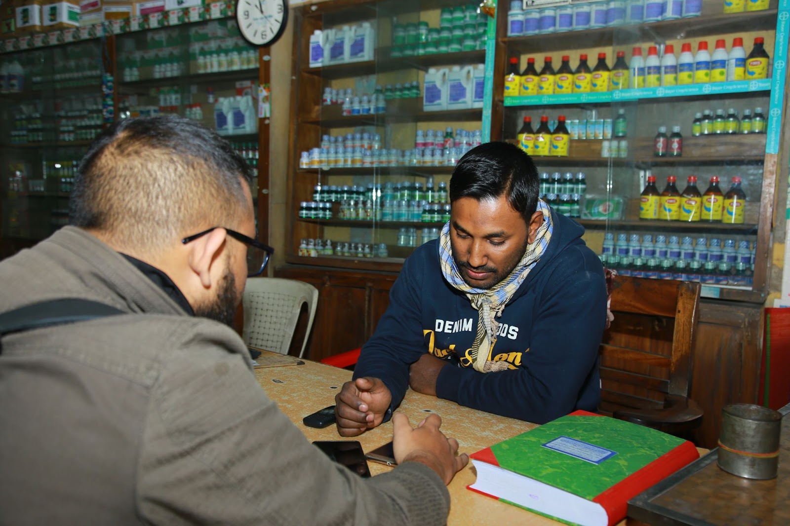
Focused group, interviews, and Surveys: To begin, we planned the steps for the research and ideation. In a focus group research, we gathered the people who would initially be working on selling farming goods. For this, we targeted the area of Bogura. In one-to-one interviews, we collected user journeys and pain points they faced in their daily life on selling goods. We gathered data and created surveys and questionnaires to build our system.
-
Record of business transactions
-
Inventory Management
-
Request for loan
-
Access to distributor
-
Offer technical support
-
Usability Testing: We did the prototype test with 2 different types of users (one was the group of young people who had some knowledge about using a smartphone, another one was the group of above middle-aged people who had no idea how to use an app). In each one of them, we classified the data and got three main categories:
-
Insights: Contains some points that are not related to a specific task but will help us with understanding the user.
-
Issues: Contains the issues generated by the user during each task.
-
Suggestions: Contains the user suggestion during the test which might turn out to be a feature that needs to be added to an existing flow.
What are the outcomes?
After testing the prototype, we understood which areas are needed to be improved. Our findings from the testing are:
-
The new transaction entry flow is not understandable.
-
The way customer adds process, needs to be changed.
-
Need to add the order history and order details page.
What lessons did we learn in the whole process?
We struggled a lot during user interviews. A few more of our mistakes were-
-
Pressuring ourselves to finish the interview fast.
-
Skipping questions in our interview guide because of time management.
-
Sometimes we did not follow the natural flow of conversation. We were trying to hold on to our interview guide like a script.
This was the first test and research we could do on our retailer app and for sure it will not be the last one as we got a lot of user insights and things that we never imagined that have a problem.

01302536026
01784167973
.jpg)